- ANIMATION
- BRANDING
- Content Creation
- Design
- DEVELOPMENT
- Digital marketing
- Search Engine Optimization
- Smm
- Uncategorized
12 Must-Have Pages on Your Ecommerce Site

How to build an ecommerce website?
No doubt that the quality of a product is essential for business success, but it’s not its sole determiner. When addressing ecommerce in this context a website design and its marketing would be not less but, perhaps, just as important a factor affecting prospective customers’ decision to buy.
Here, we would like to focus on the ecommerce website design, namely its architecture – a chief generator of the online shopping experience and consequently the ecommerce business performance.
The following are the 12 must-have pages on your ecommerce website.
Landing Page
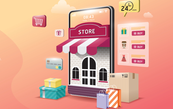
Your ecommerce landing page is a storefront of your online business – it welcomes your customers by providing them with the most essential information and links to other pages on your website. The landing page is your key initial impression maker, a touchpoint for potential shoppers, and an engaging brand wrapper for repeat customers. It should be adapted to your specific audience, motivating your traffic to convert, and entice by both brilliant design and real value.
Your ecommerce landing page may include sections like:
- Unique value proposition
- Featured products, or bestsellers
- New arrivals
- Recommended, or personalized items
- Risk reducers, such as free shipping and returns
- Loyalty program
- Text or video content

Category Page
This page is a display area of your online store where products can be browsed under specific categories. Since category page lists all your products it accounts for the majority of search traffic, thus playing an important role in conversion. Think of this page as the most precious asset of your ecommerce store – design, optimization (SEO), and sales-wise – that makes your customers’ journey smoother and website crawling better.
Product Page
This is an ‘aisle shelf’ that stores an individual product and provides the information about it. The item of choice is perused and put into the cart here by clicking the “add to cart” button. Make sure to build the product page effectively and your conversion will skyrocket, because, functionally, your product page equals to your landing page, just on a smaller scale. It should be convincing enough to encourage browsers to add to cart and fully explain both the product and your business as not all the customers land right on your landing page when browsing. Thus, keep the page product-focused and brand-consistent, inspiring and confidence-boosting. The bottom line, the power of your product page makes or breaks your online store.
Cart
This is the page listing all the items that your customer wants to purchase. If you provide promo codes, this is a place where your customer can use them and also check the shipping cost to their location. The cart page is often overlooked in terms of design and functionality. However, merely listing the items and organizing an untended check out process is no longer sufficient. Having a clean, simple, intuitive design is essential to minimizing the cart abandonment rate as well as including customization options, the ability to purchase add-ons and the like.
Search & Search Results
eCommerce websites can’t do without a search functionality designed specifically for those who know exactly what they want and do not wish to waste their time wading through the web pages. Compared to other ecommerce website essentials, site search is the most overlooked function. But taking an extra effort to improve it can make a big difference, leading to happier shoppers who keep coming back and share their experience with others.
Login/Create Account
Return and loyal customers expect to have their information kept for easy ordering. A personal account is also a great way to manage reward/loyalty programs. Additionally, a creative and attractive login page catches the attention of new visitors and helps increase your customer base. Most login pages include username, password, and a highlighted Call-To-Action button.
FAQ Page
This is your space for answering the most frequent shoppers’ questions. The frequently asked questions (FAQ) page will tell your customers everything they need to know to browse your ecommerce website with comfort, saving you the time of dealing with repeated questions. Your answers should be a persuasive call for potential customers to take the necessary steps and buy whatever you’re selling.
About us Page
Your contact page provides shoppers with the ways to get in touch with you. It might seem like ‘just another’ web page that often belongs to the list of the under-optimized website locations. Such neglect is a huge mistake though, because feedback is vital to customer service. The experience of your shoppers is where your assumptions about your website meet reality. Therefore, making it easy for your customers to reach you is a sure way to creating better customer experience and building trust.
The ecommerce website is a contemporary mode of in-store display. You should be continually changing and developing your online store so that your customers have the best online shopping experience possible. Incorporating the 12 must-have pages into your ecommerce site will undoubtedly amplify your efforts in public outreach, ensuring your success in the highly competitive ecommerce landscape.
Today, more than ever, high-quality website design is an essential business asset in ecommerce.
When citing, referencing, or reposting any part of or the entire article, be sure to keep the link to the original.
Designing a new website?
Redesigning an existing one?
Our team is ready to help. Let’s discuss your project.
contact us


